In 2018 – 2019 I had the opportunity to revisit the packaging for a line of artisan teas, which I had originally completed in 2015. Additionally, the client had a new overarching brand and needed a refreshed logo.
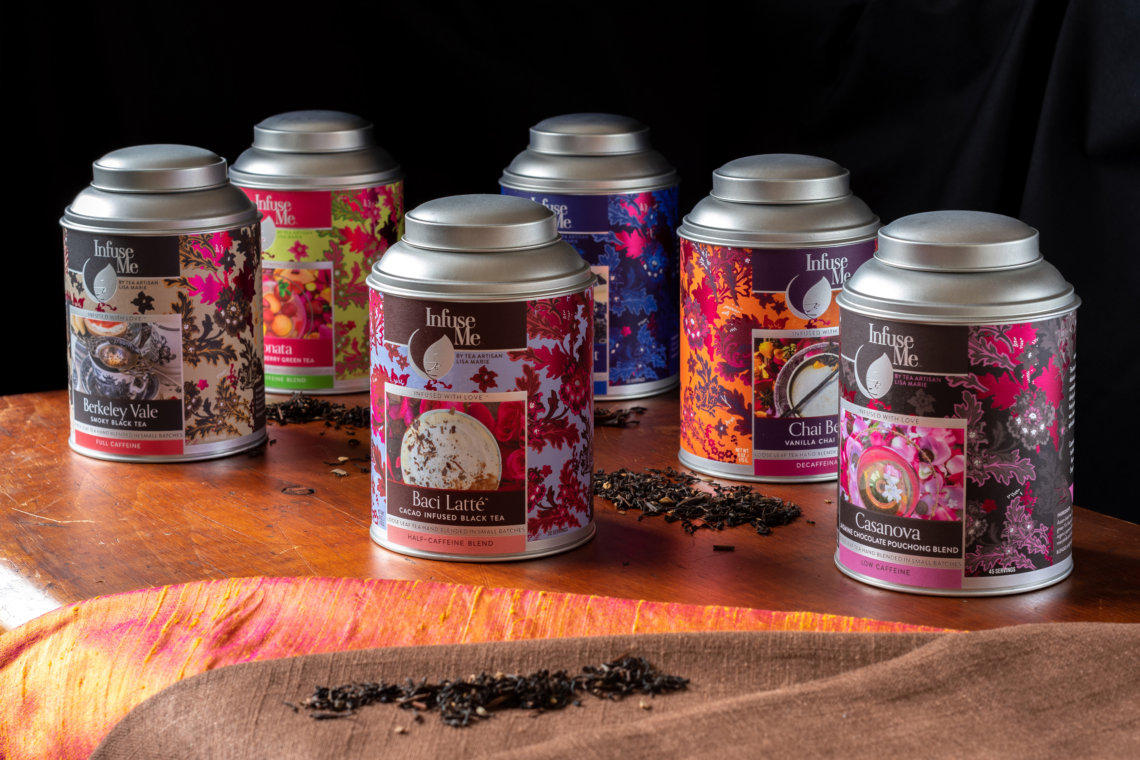
Goals of the packaging refresh included a brighter, punchier color palette in order to better communicate the various teas’ distinct and powerful flavors.
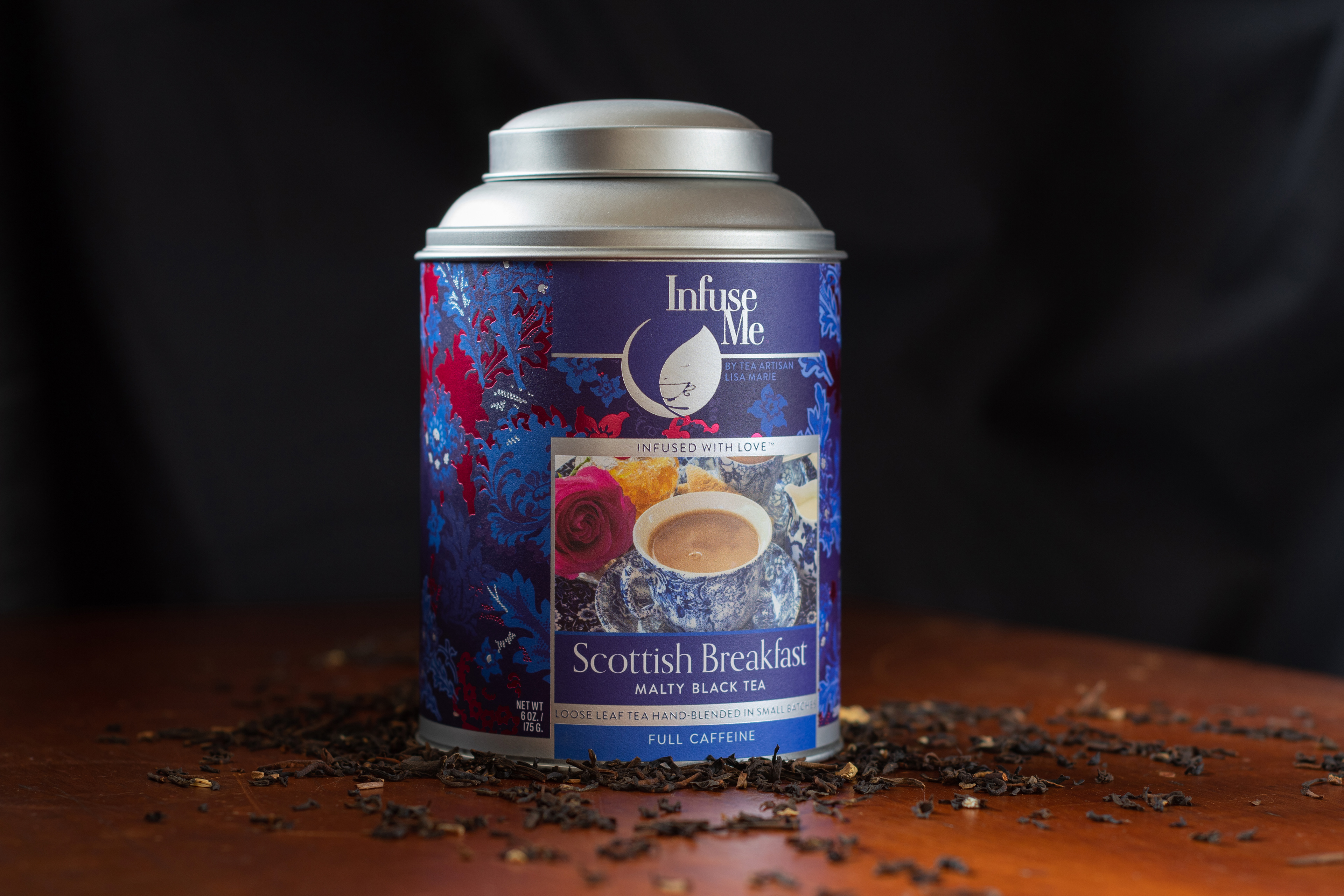
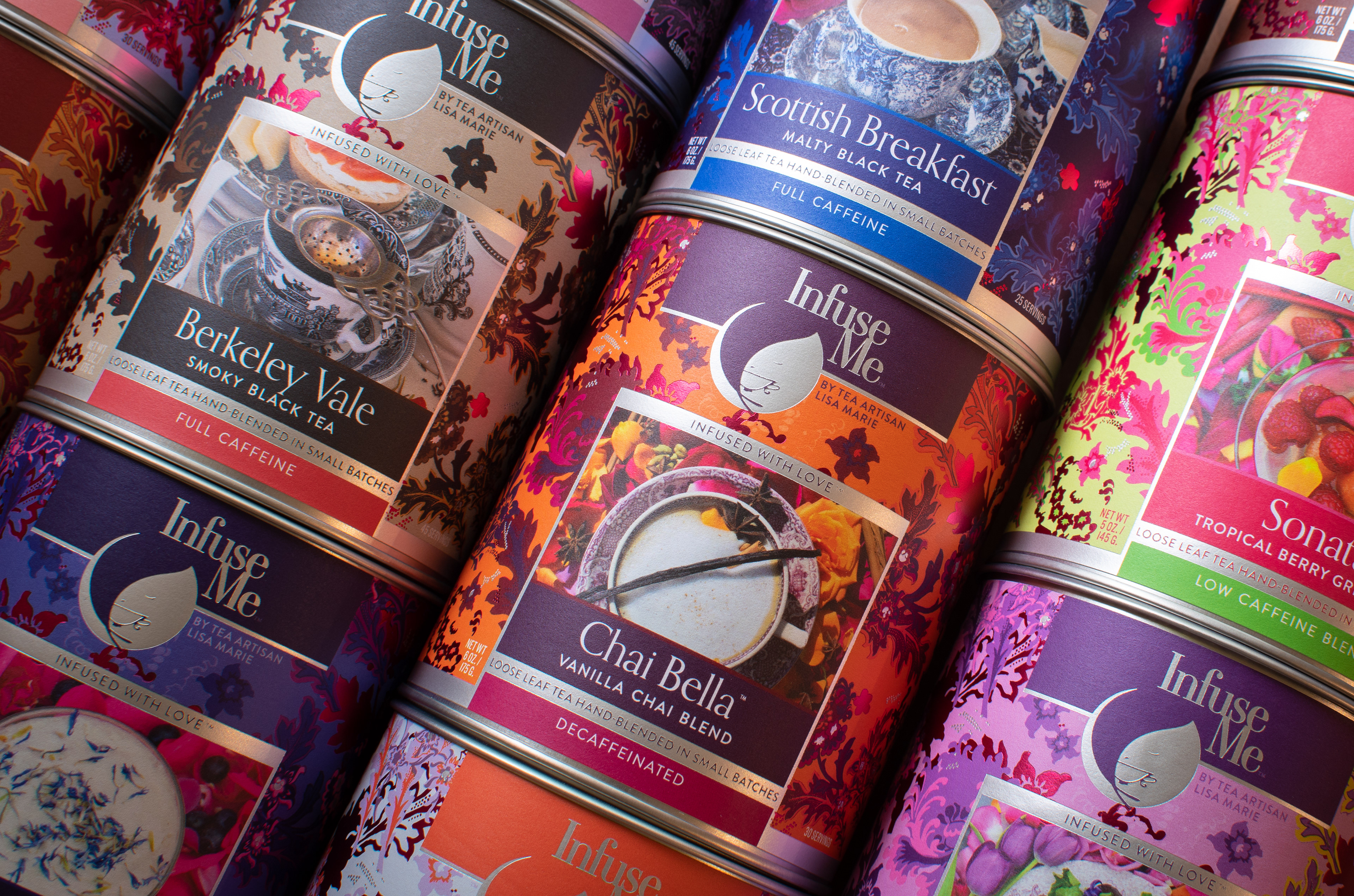
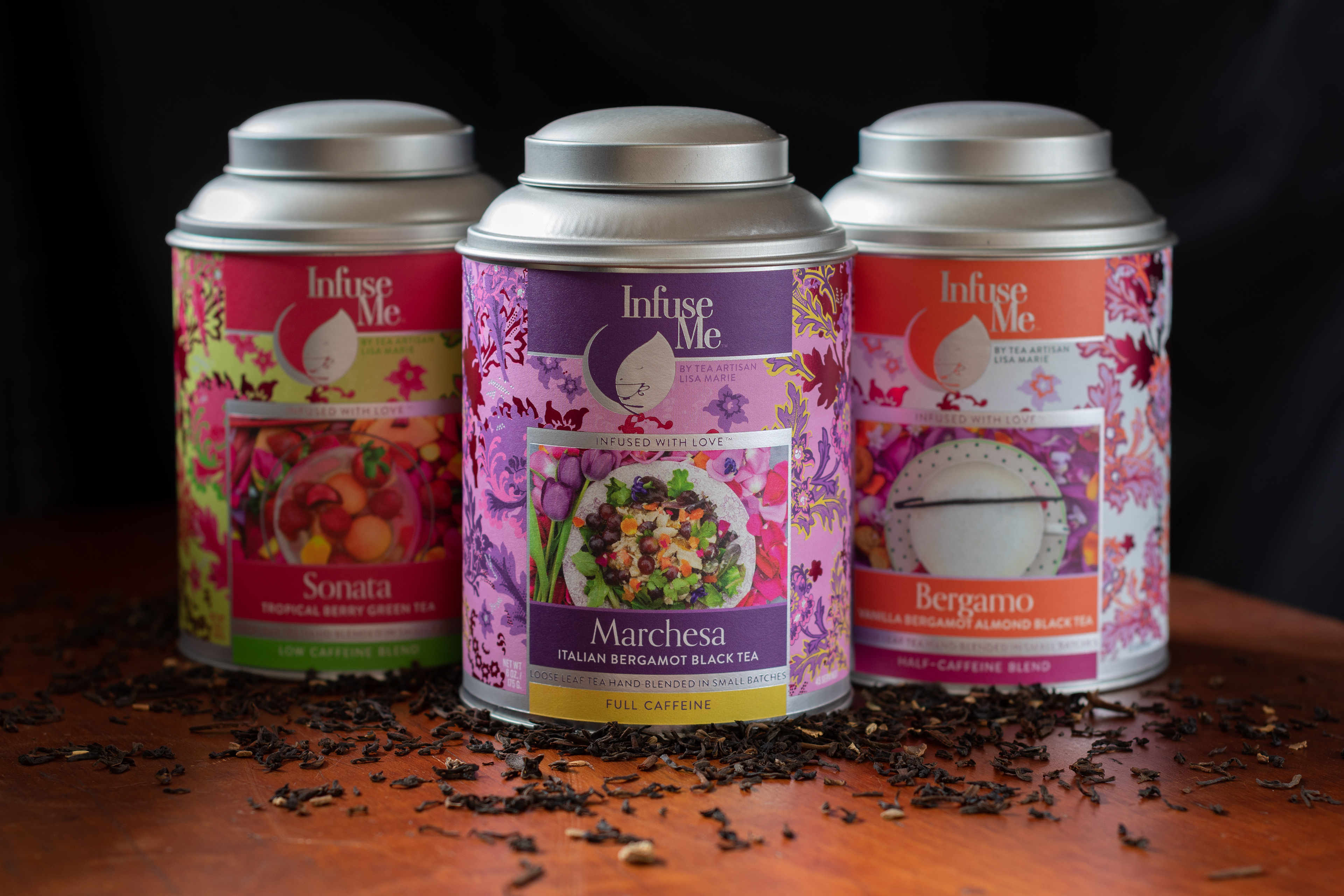
The client wanted to increase the presence of the floral background, which is a recognizable and important component of the brand. We customized the elements of the pattern this time to fit the various components of the label and allow organically-shaped pockets for the text and other information on the rear of the package.
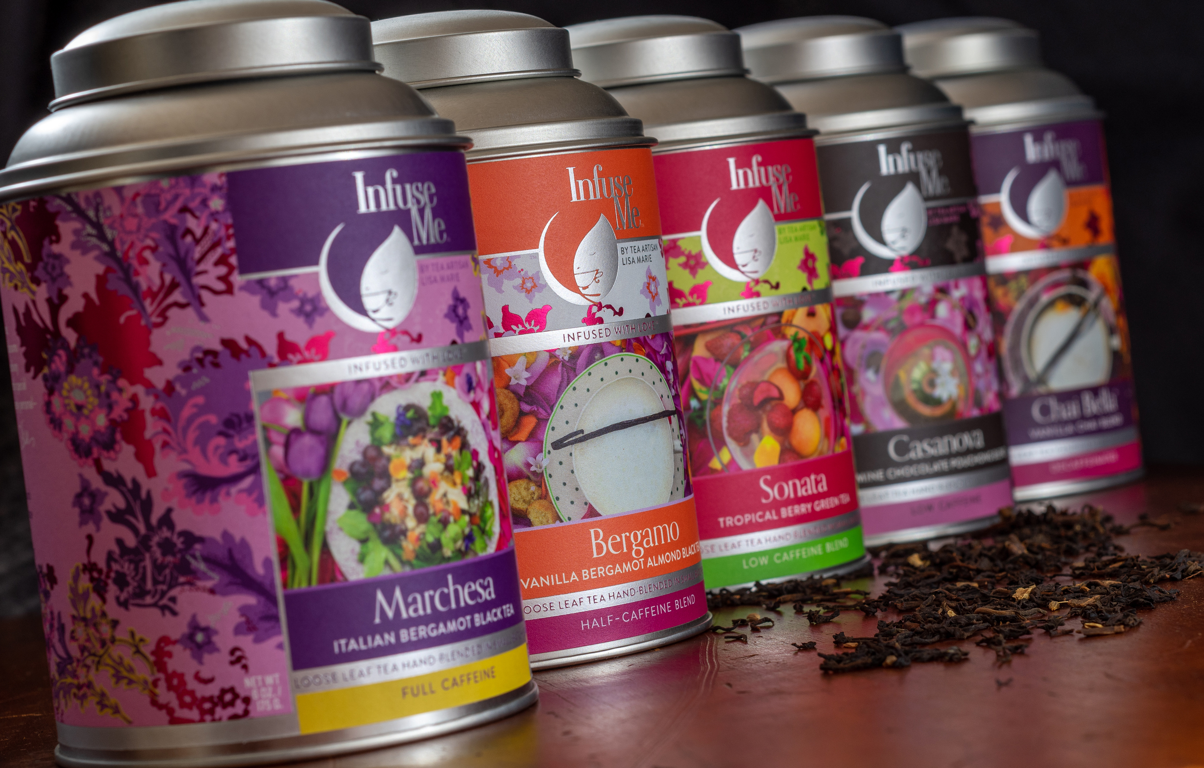
While the pattern is identical in form across the line, the palette is customized to each tea flavor, and harmonized with the photography. Two foil colors were used as well to provide additional shelf presence and enhanced quality cues.
Several new tea varieties were being introduced, so we needed to execute product photography for those labels. We worked remotely to develop the photo concept and style, which in this case was executed by the client, and applied to a number of the existing varieties.
We found that an overhead approach allowed us to echo the circular logo while showcasing a sumptuous portrayal of the beverage, prepared with a specially-developed recipe. One hallmark of the client's approach to tea is its deployment in unexpected recipes, like a salad or even a gelato!
We retained photography from several of the existing varieties. In those cases the photos became more dramatic and integrated into the overall label through palette adjustments to the floral pattern.